Real-time visualization tools transform live data streams into dynamic visuals, enabling faster, data-driven decisions. Unlike traditional reporting, these tools provide instant insights, helping businesses stay ahead. Here’s how to integrate them effectively:
- Define Goals and Metrics: Identify key decisions requiring real-time data and metrics aligned with your objectives.
- Choose the Right Tool: Evaluate platforms like Tableau, Power BI, or Zoho Analytics based on cost, features, and scalability.
- Prepare Your Data: Build reliable pipelines, clean data, and ensure consistency with tools like Kafka or Amazon Kinesis.
- Customize Dashboards: Design clear, intuitive dashboards with actionable insights using frameworks like RED or USE.
- Test and Train: Stress-test systems, train teams, and monitor performance to refine dashboards over time.
Real-time tools, when implemented thoughtfully, can boost operational efficiency and revenue growth. Platforms like AI for Businesses simplify tool selection tailored to your needs.
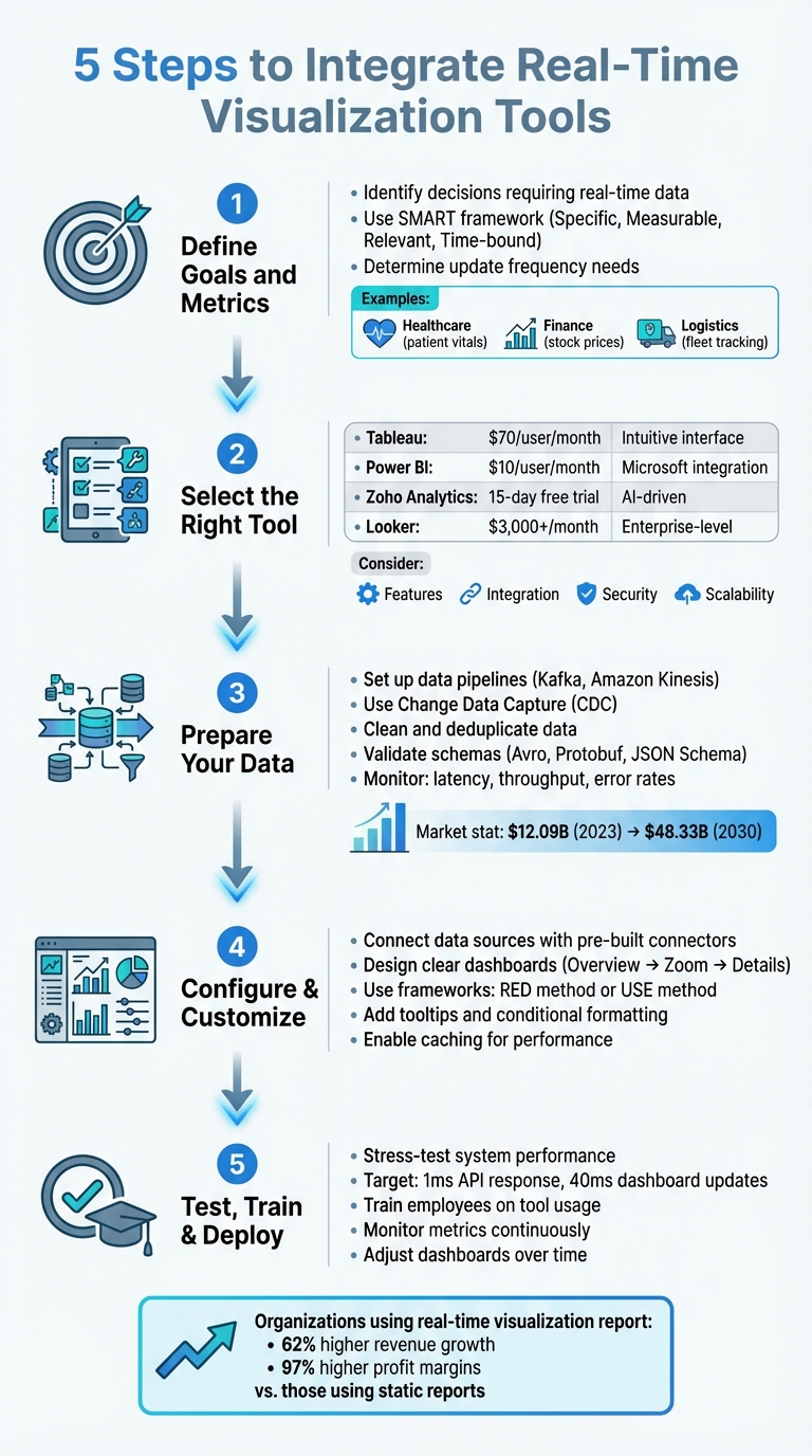
5 Steps to Integrate Real-Time Visualization Tools for Business Success
How to Integrate Power BI with Excel for Real-Time Data Analysis
sbb-itb-bec6a7e
Step 1: Define Your Business Goals and Requirements
Before diving into integration, start by asking yourself a simple yet crucial question: "What decision needs to be made faster with real-time information?" This question helps you zero in on actionable, time-sensitive metrics that truly matter.
As Emily Lucek, Technical Content Creator at Estuary, wisely notes:
"Every great dashboard starts with a clear purpose. Before writing a single line of code... it's essential to define what you're measuring and why".
The purpose of your real-time dashboards will vary depending on your industry. For example:
- Healthcare teams might monitor patient vitals in real time.
- Finance departments could track stock prices or failed transactions.
- Logistics operations may follow fleet locations or warehouse inventory.
- Engineering teams often transform event streams into embedded product features aimed at capturing new market segments and reducing churn.
The main goal is to pinpoint scenarios requiring immediate action rather than those that can wait for daily reports.
When defining your goals, also decide how frequently data needs to update. High-intensity operations might need second-by-second updates, while broader trend analysis can work with minute-level updates. Don't forget to factor in user device capabilities - network limitations can affect how much data you can send and how often. Early decisions about key parameters like latency (milliseconds vs. seconds), data volume (thousands vs. millions of rows), and interactivity (filtering and zooming) will shape your dashboard's effectiveness.
Identify Key Metrics to Track
Choosing the right metrics is a team effort. Collaboration between data engineers, business intelligence teams, and senior leadership ensures your dashboards align with both technical capabilities and business goals. Without this input, you risk creating dashboards that might look impressive but fail to drive meaningful decisions.
To organize your metrics, use a tiered framework:
- Macro-level metrics: These include system-wide indicators like reliability and uptime.
- Micro-level metrics: Focus on detailed measures such as workflow bottlenecks or error rates in specific API endpoints.
For business operations, this could mean tracking sales figures, customer engagement rates, or inventory levels. For system performance, focus on metrics like data processing latency, pipeline throughput, or transformation accuracy.
Make sure your KPIs follow the SMART framework:
- Specific: Clearly define what you're measuring.
- Measurable: Use quantifiable data.
- Relevant: Tie metrics to your strategic objectives.
- Time-bound: Track performance over defined periods.
For example, instead of a vague goal like "improve customer experience", aim for something actionable, like "reduce checkout abandonment rate by 15% within 30 days by monitoring real-time cart activity."
Review Current Systems and Data Sources
Once your goals and metrics are clear, evaluate whether your existing technology stack can support them. Start by reviewing your infrastructure's capacity for handling the required data scale and update frequency. For instance, a dashboard tracking social media sentiment might process millions of events per hour, while a sales dashboard might handle thousands of transactions per day.
Next, ensure your systems are equipped for low-latency protocols like WebSockets or Server-Sent Events, which are much faster than traditional REST API polling. Your database architecture also plays a critical role. Row-oriented databases like PostgreSQL or MySQL may struggle with large-scale aggregations, whereas columnar databases such as ClickHouse or Apache Pinot are designed for fast analytical queries, making them ideal for real-time visualizations.
Optimizing SQL queries is another important step. For example, filtering data early and indexing key fields can significantly reduce the load on your system. Implementing a Time To Live (TTL) policy can cut down data processing from 200 million rows to just 3 million for a 30-day visualization window. Finally, confirm how your visualization tool will connect to your systems - whether through streaming platforms like Kafka or Amazon Kinesis, or via direct database connections.
With your goals defined and systems reviewed, you're ready to move on to selecting the right visualization tool.
Step 2: Select the Right Visualization Tool
Once you've established your goals and infrastructure, the next step is choosing a visualization tool that aligns with your needs. This decision is critical, as the right tool can directly impact how effectively your team leverages real-time data.
Tableau is a popular choice due to its intuitive interface and extensive visualization options, but at around $70 per user per month, it may not be ideal for handling large datasets without stretching resources. Microsoft Power BI, on the other hand, integrates seamlessly with the Microsoft ecosystem and comes at a more affordable $10 per user per month. If you're looking for AI-driven features, Zoho Analytics offers a 15-day free trial (no credit card required) and supports natural language queries. For larger enterprises with complex data needs, Looker starts at $3,000+ per month.
For small to medium-sized businesses or scaling companies, platforms like AI for Businesses can help streamline the selection process. Their curated tools let you filter options by budget, data volume, and technical features, saving you considerable time and effort.
Compare Features and Integration Options
When evaluating tools, ensure they support the necessary data transport protocols. For ultra-low latency requirements, such as in financial trading, WebSockets enable bidirectional communication. If you only need server-to-client updates, Server-Sent Events (SSE) might be a simpler option. For example, Power BI offers DirectQuery to work with massive datasets without importing them, though its Pro workspaces have a minimum refresh interval of 30 minutes (reduced to one minute in Fabric or Premium capacities).
Seamless integration is another priority. Look for tools offering REST APIs, JavaScript SDKs, or simple embed codes like iframes. For instance, Tableau's Embedding API v3 provides flexibility for integrating visualizations into your applications.
Security is crucial, too. Features like Single Sign-On (SSO), JWT/OAuth 2.0, and row- or column-level security ensure sensitive data stays protected. As Isaac Sacolick from InfoWorld points out:
"There's often a trade-off between real-time data availability, performance, and implementation complexity".
For rendering large datasets, Canvas or WebGL (GPU-accelerated) handle millions of data points more efficiently than SVG, which is better suited for smaller, interactive graphics. Advanced features like live filtering, zooming, and drill-downs can further enhance usability.
Keep in mind that most platforms use per-user subscription models, which can add up quickly when embedding visualizations for external customers. Power BI, however, offers capacity-based plans that are more cost-effective for large-scale deployments. Before committing, consult with data source owners - frequent updates (e.g., every few seconds) can place a heavy load on servers.
Evaluate Scalability and Long-Term Value
As you assess tools, consider scalability. A solution that works well today might falter as your business grows. Verify that the tool can handle both structured and unstructured data and scale to accommodate millions - or even billions - of records without performance issues. Scalable visualization tools empower teams to interact with large datasets effectively, driving measurable ROI through better decision-making.
Deployment flexibility is another factor. Whether your infrastructure is on-premises, cloud-based, or hybrid, the tool should adapt to your setup. Also, ensure it complies with industry standards like SOX, SOC, ISAE, GDPR, or HIPAA to avoid future legal or migration challenges.
Don't overlook Total Cost of Ownership (TCO). Licensing fees are just the start - account for training, updates, IT support, and additional features. Organizations leveraging real-time visualization tools have reported 62% higher revenue growth and 97% higher profit margins compared to those using static reports, making the investment worthwhile when done right.
Evaluate AI capabilities during trial periods. For instance, Zoho's Zia assistant allows users to query data using natural language, making it easier for non-technical team members to engage with the tool. AI-driven features like automated insights and anomaly detection can provide long-term benefits by identifying trends without manual intervention.
Finally, conduct load testing to simulate real-world usage. A single dashboard page refreshing every five minutes with two visuals can generate up to 240 queries per hour if accessed by 10 users simultaneously. Slow dashboards often result from database inefficiencies rather than the visualization tool itself - techniques like pre-computed aggregations and caching can help improve performance.
Once you're confident the tool meets your scalability and value needs, you're ready to move on to data preparation.
Step 3: Prepare Your Data for Integration
Once you've selected the right tool, the next step is to get your data ready for real-time visualization. Clean and well-organized data forms the backbone of any effective visualization system. Without it, even the most advanced dashboards can end up showing inaccurate or incomplete insights.
The global market for data pipeline tools was valued at about $12.09 billion in 2023 and is expected to grow to $48.33 billion by 2030. By 2026, over half of business systems are predicted to rely on real-time context data for decision-making. This highlights the importance of structuring your data pipelines correctly from the very beginning.
Set Up Data Pipelines
Creating a reliable data pipeline ensures a smooth connection between your source systems and the visualization tool. A popular method is Change Data Capture (CDC), which captures row-level changes - like INSERT, UPDATE, and DELETE operations - directly from database transaction logs. It does this without slowing down the production systems.
To handle traffic spikes and ensure fault tolerance, consider using a message bus or queue system like Apache Kafka or Amazon Kinesis. These tools decouple data sources from destinations, allowing for high throughput even during peak loads. Many modern pipelines use the ELT approach, where raw data is loaded into a cloud warehouse and transformed in real time. For flexibility, design your pipeline with modular, loosely connected components. This allows individual stages - such as ingestion, transformation, and loading - to scale or update independently.
For dashboards that demand instant updates, materialized views in real-time databases can be used to pre-calculate and store incremental aggregations.
As Streamkap puts it:
"Identifying your data sources is the most strategic step in the whole process and if you get sloppy here, your entire pipeline might struggle before it even gets off the ground".
Once your pipeline is set up, focus on maintaining accuracy and consistency in the data being processed.
Verify Data Accuracy and Consistency
A well-built pipeline won’t deliver value if the data it processes is flawed. Start by cleaning and deduplicating your data to remove errors and inconsistencies. Interestingly, about 33% of pipeline faults are caused by incorrect data types. To prevent issues like "schema drift", use schema validation tools such as Avro, Protobuf, or JSON Schema at the ingestion point.
Standardizing data is equally important. Convert time zones to UTC, format currencies to US Dollars, and use consistent address abbreviations (e.g., "Street" vs. "St."). For real-time systems, validation must happen instantly. As Team Estuary explains:
"Applying old-school data quality strategies to real-time systems is like trying to fix a moving car with a wrench and duct tape".
Incorporate checks for data types, valid ranges, and null values - for example, ensuring transaction amounts aren’t negative. Use unique event identifiers like UUIDs or ULIDs to prevent duplicate records caused by network retries or system restarts. Any malformed or invalid records should be routed to Dead Letter Queues (DLQs) for review without disrupting the main data flow. For sensitive data, apply PII masking during the transformation phase to stay compliant with regulations like GDPR or HIPAA.
Finally, continuously monitor key metrics like latency (time from source to destination), throughput (records per second), and error rates to keep your pipeline running smoothly. Tools like Prometheus, Grafana, Datadog, and OpenTelemetry can provide the visibility needed to detect and resolve issues before they impact your dashboards.
Step 4: Configure and Customize the Visualization Tool
Now that your data pipelines are ready, it’s time to connect them to your visualization tool and create dashboards that turn raw data into meaningful insights. This is where your data becomes actionable, helping your team make quicker, more informed decisions.
Connect Data Sources to the Tool
Modern visualization tools often include pre-built connectors for popular data sources, simplifying the process of authentication and data retrieval. If your source isn’t supported natively, explore the plugin catalog - tools like Grafana offer over 150 plugins contributed by the community and partners.
Connecting a data source usually involves entering a server URL and authentication credentials. Use the "Save & Test" function to confirm the tool can communicate with your backend before proceeding to dashboard creation. This small step can save you hours of troubleshooting later. Once connected, you’ll have access to query editors tailored to your data structure, like KQL for Microsoft Fabric or SQL modes in tools like Retool.
To enhance performance and manage costs, consider enabling caching with systems like Redis or Memcached. This ensures stability and helps avoid rate-limiting issues.
When configuring permissions, assign roles - such as Query, Edit, or Admin - to control who can access or modify data sources. This protects sensitive information and keeps configurations secure. For effective monitoring, set auto-refresh intervals and define a "Minimum time interval" to maintain a balance between system load and data freshness. Using query parameters to filter data early in the retrieval process can also significantly boost rendering speed. These steps lay a solid groundwork for building dashboards that are both clear and actionable.
Design Clear Dashboards
With your data sources connected and optimized, the next step is creating dashboards that communicate insights effectively.
Good dashboards prioritize simplicity and clarity. Stick to the "Overview first, zoom and filter, then details-on-demand" approach, which naturally guides users through layers of data. Start with "Big Numbers" at the top to provide an instant snapshot of key metrics, followed by detailed charts for deeper exploration.
As Robert Kosara, a Data Visualization Developer at Observable, puts it:
"A well-designed dashboard doesn't yell at its users, but subtly helps them read and navigate the information through a clear visual hierarchy".
Before diving into design, identify the three or four key metrics your audience truly needs. Think about the decisions these metrics will support. If you can’t pinpoint their purpose, the dashboard might not be necessary. Keep the layout focused and uncluttered - if it starts feeling too crowded, consider splitting it into multiple pages or using drill-down features.
Maintain consistency in color schemes, naming conventions, and spacing to ensure a polished look. Remember, the human eye can only distinguish about 10 distinct color hues at once, so avoid overloading your visuals.
Add customized tooltips to provide extra context on hover without overwhelming the display. Conditional formatting can help highlight important trends or anomalies, like changing bar colors when values exceed targets. Horizontal or vertical reference lines are also useful for marking benchmarks, sales goals, or key events like promotions.
For monitoring systems, consider using tried-and-true frameworks like the RED method (Rate, Errors, Duration) for microservices or the USE method (Utilization, Saturation, Errors) for hardware resources. These frameworks focus on metrics that matter most. Lastly, include text panels or annotations to explain the dashboard’s purpose, data sources, and how to interpret specific KPIs. Clear documentation reduces confusion and saves time.
Step 5: Test, Train, and Deploy
Wrap up your process by thoroughly testing, training your team, and deploying dashboards to ensure they perform well in real-world scenarios.
Run Complete Testing
Before rolling dashboards out across your organization, put them through rigorous testing. Simulate data changes to confirm that updates flow seamlessly from the source to the dashboard in near real-time. This step ensures your entire pipeline - from data capture to display - is functioning as intended.
Stress-testing is also crucial. Use tools like JMeter or Gatling to evaluate how your system handles high data volumes. Aim for API responses within 1 millisecond and dashboard updates within 40 milliseconds. These tests help you identify and address bottlenecks before they disrupt critical operations.
Emily Lucek, a Technical Content Creator at Estuary, puts it succinctly:
"A real-time dashboard is only as good as the pipeline behind it."
Don't forget to test dashboards across devices and screen sizes to ensure consistent performance. Fine-tune refresh and query settings during this phase. Keep an eye on pipeline health metrics like capture status, materialization lag, throughput, and error rates caused by schema mismatches. For WebSocket connections, strategies like exponential backoff, throttling, or debouncing can help manage reconnections and rendering under high data velocity.
Train Employees on Tool Usage
Even the best dashboards are useless if your team doesn't know how to use them effectively. Training should go beyond teaching basic navigation - employees need to understand how to interpret the data and apply it in their roles.
Offer a mix of learning tools to suit different preferences. Interactive quizzes, short videos, and hands-on sessions are often more impactful than lengthy manuals. Focus on empowering employees to use features like filters, drill-downs, and zoom tools so they can explore data independently. Tailor training based on roles - managers might need dashboards that highlight team performance, while individual contributors may benefit from metrics tied to their specific tasks.
For example, LAZ Parking used Absorb LMS to roll out region-specific dashboards. This allowed managers to track training progress and employee engagement effectively.
Teach the basics of visual perception, such as how size, color, and position can make data easier to process than text. Explain the purpose behind each metric so employees understand how it connects to their responsibilities and the company’s broader goals. With proper training, customizable reports can cut reporting time by up to 90%. Real-time polling and instant quizzes during training can also help pinpoint areas where additional support is needed.
Once your team is comfortable with the tools, keep monitoring their usage and adapt as needed.
Monitor and Adjust Over Time
After deployment, keep a close eye on both technical and business metrics to measure success and identify areas for improvement.
Track technical metrics like materialization lag, throughput, error rates, and even user login frequency to assess system performance and adoption. Regularly monitoring these metrics allows organizations to recalibrate strategies more effectively.
For instance, in February 2026, Austin Capital Bank used ThoughtSpot’s self-service analytics to monitor marketing KPIs in real time. By analyzing lead generation and conversion data, they reduced their paid search spend by 50% and improved their revenue margin by 30%. Similarly, The Insurance Surgery increased daily call volume per sales representative from 150 to 213 by using Plecto dashboards.
Set threshold alerts for critical metrics - spikes in error rates or drops in conversions should trigger immediate notifications. This enables your team to act quickly and resolve issues. Use monitoring tools like New Relic or Datadog to track rendering latency and user interaction errors. Regularly verify that the data in your dashboards matches the source systems to maintain user trust. As your business evolves, update refresh intervals, add relevant metrics, and retire outdated ones to ensure your dashboards stay aligned with your goals.
Conclusion
Using real-time visualization tools can completely change how your business approaches decision-making. By following five key steps - defining your requirements, choosing the right technology, preparing data pipelines, configuring dashboards, and conducting thorough testing - you can build a system that delivers insights exactly when you need them.
Today’s advanced real-time platforms are incredibly fast, with API responses in just 1 millisecond and the ability to process over a million rows in about 40 milliseconds. This speed allows businesses to act quickly, whether it’s turning around underperforming IT projects in 90 days or responding to market shifts in real time.
As Jeffrey Richman, a Data Engineering Expert, puts it:
"Real-time data visualization is a game-changer... It allows you to monitor and analyze data as it is generated, thereby empowering you to facilitate quick data-driven decision-making."
This highlights the importance of having a well-thought-out integration strategy to make the most of real-time tools.
Choosing the right tool is key to ensuring your system works efficiently. The market offers a variety of specialized tools, each with unique strengths. Aligning your data velocity needs with the right architecture is crucial. A mismatch could result in sluggish dashboards and delayed decisions. This is where a curated directory can save time and effort.
For businesses looking to streamline their tool selection, AI for Businesses provides a handpicked collection of AI-powered solutions tailored for SMEs and scale-ups. Whether your operations require millisecond-level performance or can handle slightly slower updates, this platform helps you find the right tools without the hassle of sifting through countless options. By leveraging such a resource, you can ensure your dashboards - and your business - are set up for real-time success.
FAQs
How real-time is “real-time” for my dashboards?
“Real-time” in the context of dashboards refers to updates happening within seconds or even milliseconds, allowing users to access the most up-to-date information. This quick processing of data provides nearly instant insights, which are crucial for making fast decisions and ensuring a smooth user experience. While the specific update speed varies depending on the application, second- or millisecond-level updates are typical for achieving effective real-time visualization.
What data stack do I need for low-latency dashboards?
A low-latency dashboard data stack relies on a high-speed platform capable of real-time data ingestion and querying - Managed ClickHouse is a popular choice here. The setup usually incorporates streaming tools like Kafka and connectors that seamlessly integrate with data storage solutions such as S3 or GCS. This combination enables rapid data processing, reduces delays, and ensures dashboards remain responsive and current for smooth visualization.
How do I keep real-time dashboards accurate and secure?
To keep your data accurate, leverage AI-driven validation and continuous monitoring. These tools can spot errors, flag anomalies, suggest corrections, and ensure your records stay consistent and synchronized.
On the security front, focus on strong safeguards like secure data transmission, strict access controls, and adhering to standards such as SOC 2. Additionally, improving your infrastructure and addressing data latency are key steps to boosting both reliability and security.