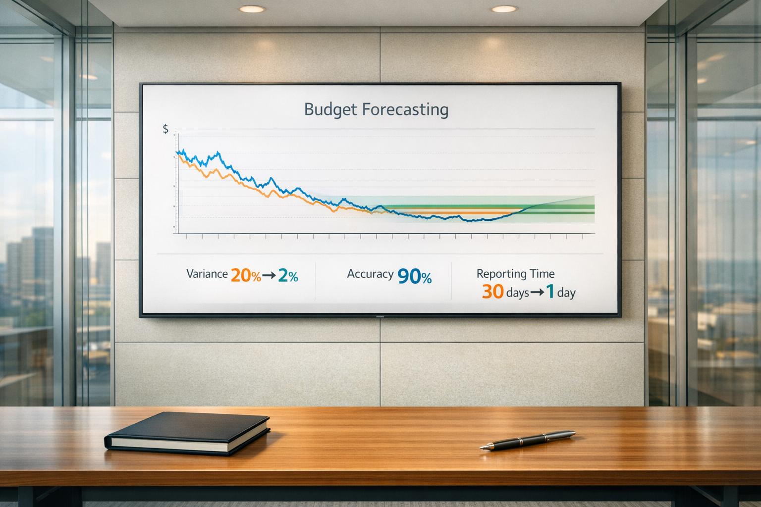
Generative AI can cut reporting and deck-building time by 50% to 80% - but only if I treat it as a draft tool, not a source of truth. The core rule is simple: clean data in, draft out, human review before anything goes to leaders. The article’s main point is that AI helps most with charts, slide copy, and short summaries, while people still need to check numbers, add business context, and approve the final message.
If I had to reduce the whole guide to a few points, it would be this:
- Start with clean inputs - fixed KPI definitions, clean dates, clear headers, and summary data instead of raw dumps
- Pick the tool by output - BI copilots for live dashboards, dashboard generators for metric explanations, slide tools for one-off decks
- Review every draft - source checks, period math, labels, and whether each visual answers a business question
- Use AI for wording - takeaway slide titles, captions, speaker notes, and short executive summaries
- Keep governance tight - access controls, traceable data, named reviewer, and approval before sharing
- Leave judgment to people - AI can draft “what changed,” but my team still decides “why it matters” and “what to do next”
A few numbers from the piece make the case plain: one cited study says AI users completed 25.1% more tasks and produced 40% higher-quality outputs than manual users, while BI and reporting tools can connect to live sources and automate weekly or monthly updates. But the article is just as clear on the risk: AI can invent figures, miss planned business changes, and mix up metric definitions if the setup is weak.
So the short answer is this: AI helps most when the workflow is fixed. I define the question, standardize the metrics, feed the right data, let AI draft the story, and then review it before it goes out.
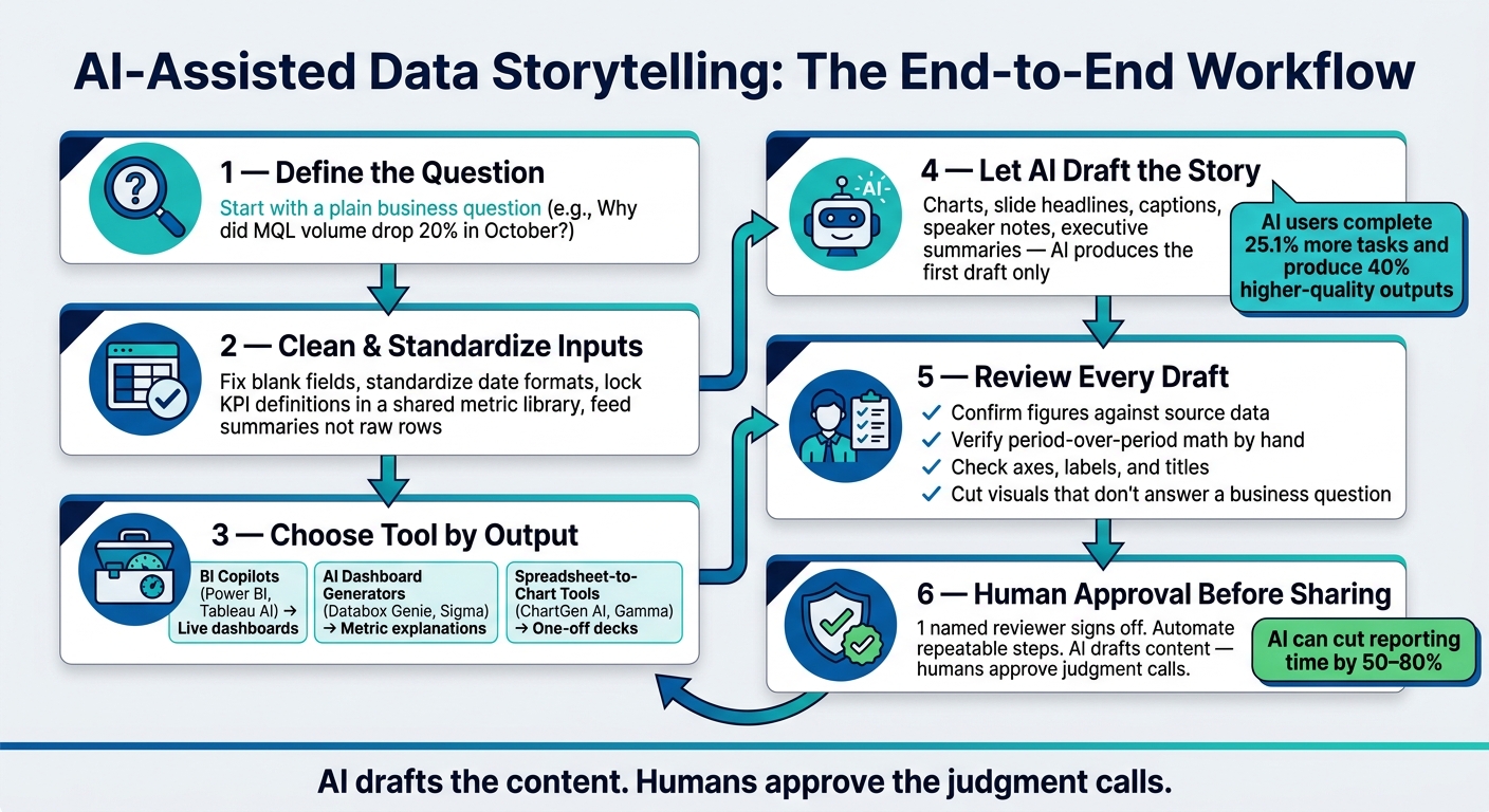
AI-Assisted Data Storytelling Workflow: From Raw Data to Approved Report
From Raw Data to Charts: A Practical Workflow
Prepare Your Data Before Using AI to Visualize It
Start with the data. If the input is messy, the chart will be messy too.
Clean blank fields, standardize date formats, and make sure headers are clear before you upload anything.[1] Small issues at this stage can turn into bad charts later.
You also need to lock KPI definitions in a shared metric library before any data goes into an AI tool. If "conversion" means one thing in HubSpot and something else in a manual spreadsheet, the AI can merge those metrics into one misleading line.[3]
Don't dump raw rows into the tool if you don't need to. Feed summaries instead - totals, averages, counts, or df.describe() - to cut token use and reduce hallucinations.[6][8] Then begin with a plain business question, such as "Why did MQL volume drop 20% in October?" That question tells you which date ranges and segments matter.[3]
Once your definitions are fixed and your summaries are ready, you can pick the tool type that fits your data source.
How AI Tools Generate Charts and Dashboards
There are 3 main tool types.
BI copilots like Power BI Copilot and Tableau AI work inside your current BI setup. They use metadata from your data model to suggest chart types and write commentary.[3]
AI dashboard generators like Databox Genie and Sigma connect straight to live warehouses or APIs. They do more than show metrics - they explain shifts in those metrics.[3] The catch is governance. It depends on how your warehouse is set up, including row-level access controls.
Spreadsheet-to-chart tools like ChartGen AI and Gamma are the easiest place to start. You upload a CSV or Excel file, and the tool guesses chart types from the column headers. They're fast and handy for one-off decks, but static uploads go stale right away.[1][3]
"The data model matters more than the AI model. A governed semantic layer with consistent definitions is what keeps the narrative accurate." - Zalak Trivedi, Product Manager, Sigma [2]
Pick the category that fits both your data architecture and your governance needs.
| Tool Category | Data Connection | Chart Choice | Narrative Support | Governance |
|---|---|---|---|---|
| BI Copilots (Power BI, Tableau AI) | Native to BI ecosystem | Metadata-based | Integrated commentary | Inherited from BI platform |
| AI Dashboard Generators (Databox Genie, Sigma) | Live warehouse/API | Context-aware | Metric shift explanation | Inherited from warehouse (row-level access controls) |
| Spreadsheet-to-Chart Tools (ChartGen AI, Gamma) | Static file uploads (Excel/CSV) | Inferred from headers | Slide-focused | User-managed |
How to Review the First Draft of Every Visual
Review every chart before it lands in a leadership deck. The first draft is just that - a draft.
Use a simple 4-step check:
- Confirm the numbers against the source data. Open the original file and spot-check the figures shown in the chart.
- Verify period-over-period math by hand. AI tools can use the wrong comparison window.
- Check axes, labels, and titles. If the chart needs extra explanation, it isn't ready.
- Cut any visual that doesn't answer a business question. If it's interesting but not useful, remove it.[1][3]
For more complex visuals, use small multiples instead of cramming everything into one chart. And if you're comparing tools, favor ones that let users click through to the underlying query or source row.[1][2][4]
Once the visuals are approved, AI can draft slide headlines and executive summaries from them.
sbb-itb-bec6a7e
Using Generative AI for Slide Copy and Executive Summaries
Once the visuals are approved, AI can draft the words that frame the numbers - slide headlines, chart captions, speaker notes, and executive summaries. The best approach is simple: let AI produce the first draft, then have a person check the message, context, and accuracy.
Turn Metrics Into Slide Headlines and Commentary
AI is useful for fixing weak slide titles. In tools like Gamma or Tome, prompt the model to use the Pyramid Principle and lead with the insight, not the category. A prompt like "Turn these notes into takeaway slide titles, not labels" [5] can shift a title from "Attrition Rates" to "Early-tenure attrition has spiked 18% since Q2." That kind of title does the job fast. It tells the audience the point before they read a single bullet.
"A takeaway title needs to make the point succinctly - the supporting detail lives in the content of the slide itself, not the title." - Cole Nussbaumer Knaflic, Author, Storytelling with Data [5]
Use the same rule for speaker notes and chart captions. Add 1 sentence on implication and business impact. The audience should see the key point within 3 seconds, which is why large KPI cards and short headlines tend to work better than dense tables. [1]
That takeaway-first style also applies when a dashboard turns into a leadership digest.
Generate Executive Summaries From Dashboards
BI-native tools like Tableau Pulse and Power BI Copilot can produce plain-English digests and anomaly alerts inside dashboards. [7] That makes them useful for weekly leadership emails, monthly reviews, and short updates sent through Slack or email.
What leaders usually need is a compact readout with 3 things:
- What moved
- What likely drove the change
- What the team should do next
Databox Genie is well suited to this use case because it connects to 130+ live sources and explains why metrics moved, not just what changed. [3]
"Dashboards show you what happened. AI-generated reports tell you why." - Nevena Rudan, Senior Content Marketing Strategist, Databox [3]
The main failure point is context. An AI tool may spot a traffic dip, for example, but miss the business reason behind it - like a planned cut in paid ad spend. To reduce that risk, add a guardrail in the prompt: "Use only facts directly supported by the data provided. Do not invent statistics." [8] After that, a human reviewer still needs to confirm that the summary matches what the team actually chose to do.
These outputs are drafts, not final truth. They still need human validation for context and accuracy.
Choosing the Right Tool for Reporting Output
Choose the tool based on the output you need first, then on workflow.
| Tool | Best For | Output Format |
|---|---|---|
| Tableau Pulse | Ongoing monitoring, anomaly alerts | Dashboard tiles, email/Slack digests |
| Power BI Copilot | Executive scorecards | Dashboard summaries, Teams notifications |
| Databox Genie | Weekly KPI digests, leadership emails | Email reports, Slack updates |
| Tome | Monthly operating reviews, board decks | Interactive web links, PDF |
| Gamma | Fast prompt-led visual decks | PPTX, PDF, web |
| ChartGen AI | Traceable data-to-slide workflows | PPTX from Excel/CSV |
BI-native tools make sense when you need live data and automated delivery on a set schedule. Presentation-focused tools like Tome and Gamma fit better when you're building a one-time board deck that needs a clear narrative and strong design. Match the tool to the output format first.
Tool choice shapes the format. Review discipline is what keeps risk in check.
Human Review, Governance, and Where Edits Still Matter
AI can draft the report. People still need to verify the numbers, the context, and whether the message fits the audience before anything goes to leadership. And once AI produces a chart or summary, governance decides if that output is safe to use.
Common Failure Modes in AI-Generated Data Stories
AI reporting breaks in a few familiar ways: it can invent facts, miss context, inherit messy definitions, or win trust too early. [3][1] Each one creates a different governance problem:
- Hallucination - figures that don't exist in the source data make it to leadership unchecked [1][7]
- Context blindness - a planned shift in strategy gets flagged as a problem [3][9]
- Data quality dependency - inconsistent KPI definitions lead to confident but wrong reports [3][2]
- Over-reliance - polished writing gets treated like final truth before anyone verifies it [3]
AI also tends to flatten tradeoffs. That means people need to put the business context back in. [5]
A Simple Review Checklist for Teams
Keep the review process simple. Assign 1 reviewer to check 5 things: [1][2]
- Every figure traces back to the source dataset
- KPI definitions match the governed semantic layer
- The narrative reflects the actual business context
- The tone fits the audience
- 1 named person has signed off on accuracy
For any report that affects decisions, use 1 reviewer and 1 approval path.
Governance controls also change based on the setup. A BI-native tool gives you one set of controls. An external AI layer gives you another.
| Control | BI-Native AI (e.g., Sigma, Databox) | External AI Layers (e.g., ChatGPT, Claude) |
|---|---|---|
| Data Access | Inherited Row-Level Security from the warehouse [2] | Manual uploads; higher exposure risk [7] |
| Semantic Consistency | Certified metrics and defined joins [2] | Infers definitions from column headers; high inconsistency risk [3] |
| Auditability | Queries are inspectable and traceable to source tables [2] | "Black box" reasoning; hard to verify specific numbers [1] |
| Approval Steps | Integrated sign-off workflows within the platform [2] | Manual copy-paste into slides; risk of stale data [2] |
Access control and auditability matter. But the final edit still sits with the person who knows what the business is trying to say.
Where Human Edits Matter Most
Human responsibility in AI-assisted reporting comes down to 3 jobs: choosing the question, choosing the metrics, and choosing the action language. [2][5]
Choose the question. A person has to decide what the report is trying to answer - and who it's for. AI can surface more content, more context, and more caveats than most people in the room need. [5]
Choose the metrics. Picking the 3 to 7 metrics that matter for the decision takes business judgment. A CFO needs variance drivers and financial impact. An operations lead needs SKU-level action items. AI can draft both. A person decides which version fits the room. [2][5]
Choose the action language. People need to add caveats about data lag, known outliers, or one-time events that skew a trend line - and approve the next step being recommended. [3][9] The final action, and the accountability behind it, stays with humans.
The last step is turning these rules into a repeatable workflow.
Conclusion: Build a Workflow That Makes AI Useful, Not Risky
Generative AI can speed up deck building. But that speed only helps when the inputs are clean, the workflow is defined, and a person reviews the output. Without those pieces, faster output just means faster mistakes.
The rule is simple: AI drafts the content; humans approve the judgment calls. That split is what makes AI-assisted reporting trustworthy instead of just fast.
For this to work, teams need to run the same process every time. Use one repeatable loop: define the question, connect live data, standardize metrics, prompt with detail, review the draft, then automate the parts that should be repeated.
Teams can use AI for Businesses to find and compare business AI tools.
FAQs
What data should I prepare before using generative AI?
Prepare clean, standardized, validated data before you ask AI to turn it into a narrative. If the input is messy, the output will sound polished but still be wrong.
Remove missing values where possible. Then make sure KPIs are defined the same way across every source, and check that the numbers line up. AI can speak with confidence even when the data underneath has problems, so this step matters.
Add metadata that helps people trust and use the analysis:
- Source names
- Last update dates
- Measurement units
If you're working with large datasets, don't dump every row into the process. Start with statistical summaries so the model can work from the main patterns without getting lost in the weeds.
Context matters too. Be clear about:
- Who the target audience is
- What time range the data covers
- What business decision the narrative is meant to support
That extra setup does more than tidy the data. It gives the AI guardrails, so the story stays tied to the facts and speaks to the right people.
Which AI tool type fits my reporting workflow?
Choose based on your main priority: data integration, design flexibility, or narrative structure.
- Structured data: ChartGen AI or Microsoft Copilot
- Fast prompt-based slides: Gamma
- Design-heavy presentations: Beautiful.ai
- Story development: Claude or Gemini
- Multi-visual business reports: RowSpeak
- Technical workflows: OpenRouter for model routing
Keep human review in the loop to check data consistency and catch hallucinations.
What should humans review before sharing an AI-generated report?
Before you share an AI-generated report, a human needs to review it. That means checking that the story matches what actually happened in the business and making sure any cause-and-effect claims are backed by the data - not guessed, assumed, or made up.
A person should also trace every figure back to its source, test the logic, and add context where the numbers look odd. On top of that, the report should read in a way that fits the audience, whether that's a leadership team, an operator, or a board member.
For high-stakes decisions, one named person should sign off on the final version. That creates clear accountability and helps make sure the report isn't just polished - it's right.