Scheduled reporting systems automate the tedious task of creating and delivering reports, saving time and ensuring data accuracy. These tools connect directly to your data sources, deliver updates on a schedule, and offer features like real-time data insights, dynamic filters, and secure access controls. Here's what makes them effective:
- Automated Scheduling: Set flexible delivery intervals (daily, weekly, etc.) with timezone adjustments and event-based triggers.
- Multi-Channel Delivery: Reports can be sent via email, Slack, Teams, or cloud storage like Google Drive and Dropbox.
- Format Options: Export reports in PDF, Excel, CSV, or image formats to suit different needs.
- Dynamic Personalization: Tailor reports for each recipient using filters without duplicating templates.
- Role-Based Security: Ensure only authorized users access specific data.
- Centralized Management: Use dashboards to track, edit, and manage schedules or resolve delivery issues.
- Alerts for Key Changes: Get notified only when metrics cross predefined thresholds.
- Seamless Integration: Connect with tools like Salesforce, QuickBooks, and Google Analytics for real-time data.
- Custom Templates: Reuse branded templates for consistency and efficiency.
- Scalability: Handle growing data and user demands without performance issues.
These systems simplify workflows, reduce manual effort, and improve decision-making by providing timely, accurate, and personalized insights.
Quick Comparison:
| Feature | Key Benefit |
|---|---|
| Automated Scheduling | Saves time, ensures timely delivery |
| Multi-Channel Delivery | Increases accessibility and engagement |
| Dynamic Personalization | Delivers tailored insights to recipients |
| Role-Based Security | Protects sensitive data |
| Alerts & Exception Reports | Focuses attention on critical changes |
| Integration | Ensures accurate, real-time data |
How to Create a Scheduled Report in ServiceNow
1. Automated Scheduling Options
Automated scheduling simplifies the process of delivering reports. Once you set it up, the system takes care of the rest. Most platforms offer flexible intervals like hourly, daily, weekly, monthly, or quarterly. You can often choose specific weekdays for delivery, while advanced tools even allow for custom schedules using cron expressions. For example, you might schedule a report for the "first business day of every month" or "every Tuesday and Thursday at 9:00 AM." These options ensure timely and dependable reporting.
One tip: avoid scheduling reports on the 31st of the month. Since not every month has 31 days, this can lead to skipped deliveries. Instead, choose "last day of the month" or the 28th for more consistent results.
Time zone settings are another key factor. Many systems default to the creator's time zone, which can cause issues for recipients in other regions. For instance, a report scheduled for 8:00 AM EST could arrive at 5:00 AM PST. The best platforms address this by allowing delivery to match each recipient's local time.
"Recipients in Tokyo, London, and New York each receive the report at 8 a.m. their local time, not yours." - Bricks
This demonstrates how time zone flexibility can make a big difference for global teams.
For project-specific reporting, you can define start and end dates. For example, you might schedule a campaign report to run every Monday from June 9, 2026, to September 28, 2026. Some systems also offer event-based triggers, sending reports immediately after a connected data source updates. These options ensure decision-makers always have access to the most current insights.
2. Multi-Channel Report Delivery
A reporting system shouldn't just create reports - it also needs to ensure they reach the right people through the right channels. Modern tools are designed to deliver reports across multiple platforms, helping teams access timely insights with minimal effort.
Email remains a go-to option, supporting formats like PDF, Excel, CSV, and HTML. But today’s systems go beyond email. For teams that rely heavily on tools like Slack or Microsoft Teams, having reports delivered directly to these platforms can significantly boost engagement. As Astrato Analytics explains:
"Scheduled reports can deliver to email, Slack channels, Teams, S3, Google Drive or SharePoint... For internal teams who live in Slack, this often gets way more engagement than an email attachment."
Reports can also be uploaded to cloud storage services like Google Drive, OneDrive, Dropbox, Box, and Amazon S3. This is particularly helpful for compliance purposes or when large teams need centralized access to data. For more technical workflows, options like SFTP/FTPS and webhooks allow reports to integrate directly into downstream systems or trigger automated actions in other software. These integrations reduce manual work and speed up processes.
Helpful tips: To avoid unnecessary notifications, enable "skip if empty" delivery for reports with no data. Protect sensitive information by using PDF encryption with data-specific passwords, especially for external recipients. If email attachment filters are causing issues, consider embedding the report as an HTML or inline image instead of attaching a PDF.
Managing recipients can also be streamlined through automation. Advanced systems can dynamically update recipient lists using database queries or CRMs like Salesforce, saving time and reducing errors.
3. Format Flexibility and Data Export
Scheduled reporting systems are designed to meet the needs of everyone involved, from CFOs to data analysts, by automatically generating reports in formats tailored to their specific requirements. For example, a CFO reviewing quarterly financials might prefer a polished, printable format, while an analyst may need raw, editable files for deeper analysis. The right system handles both seamlessly, ensuring that every stakeholder receives data in the format that works best for them.
When it comes to executive and board-level reporting, PDF is the standard. It ensures that layouts, charts, branding, and formatting remain intact across multiple pages. As Daasity explains:
"PDF is the most reliable choice as it preserves the layout across multiple pages if needed... Use PDF when in doubt, especially for formal reporting."
On the other hand, Excel (.xlsx) is indispensable for finance and operations teams. The best tools don't just export static data but also retain formulas, formatting, and layouts, making the files immediately usable. Astrato Analytics highlights this advantage:
"Exports preserve formulas, cell formatting, and layout - not just pasted values. You can hand the file to a controller who can keep working in Excel without rebuilding anything."
For analysts or system integrations, CSV files provide raw, clean data that can be manipulated or ingested into other systems. Meanwhile, images (PNG/JPEG) are perfect for quick updates shared through platforms like Slack or Teams, where recipients only need a fast visual overview. Some platforms even support PowerPoint (.pptx), allowing teams to populate branded slide decks with live data.
Here’s a quick summary of the best use cases for each format:
| Format | Best For | Key Benefit |
|---|---|---|
| Executive & board reporting | Preserves visual layout and branding | |
| Excel | Finance & data controllers | Maintains working formulas for further analysis |
| CSV | Analysts & system integrations | Provides clean raw data for manipulation or ingestion |
| Image | Quick internal updates | Embeds directly in Slack, Teams, or email body |
| Zip | Bulk data distribution | Packages multiple files (e.g., one CSV per dashboard tile) into one delivery |
To ensure accurate and timely exports, always schedule them after your data warehouse has completed its refresh cycle. Sending reports before the data updates could lead to decisions based on outdated numbers. Additionally, if PDF exports show issues like clipped tables or overlapping labels, adjusting the zoom level or virtual screen width - up to 3,840px - can often resolve the problem without requiring a redesign.
4. Dynamic Filters and Recipient Personalization
Dynamic filters take automated scheduling and flexible formats to the next level by tailoring reports specifically for each recipient. Generic reports can frustrate regional managers or overwhelm CFOs with irrelevant details, but dynamic filters solve this issue by customizing every report without the need to create multiple versions.
Here’s how it works: A mapping table links each recipient's email address to specific data parameters, such as "Region = West" or "Department = Finance." When the report runs, these parameters are applied, generating a unique version for each recipient - all from a single template. As Astrato Analytics explains:
"One report template can deliver hundreds of personalized versions - no need to rebuild per user, region, or customer."
This method eliminates the tedious task of cloning reports just to tweak filters. CloudAnswers sums up the advantage perfectly:
"If you find yourself duplicating the same report repeatedly just to change one filter and schedule it, dynamic filtering may save you time and simplify your report administration. Because nobody wants to get a request to add one column and realize they now have to update 150 reports that they cloned."
The efficiency gained here is incredible. For example, in 2025, the Employees Provident Fund (EPF) used CxReports to generate 47,000 personalized reports in just one hour. This was achieved by applying individual calculations through a single report definition connected to their real-time database. Beyond just data, these systems can also personalize details like email subject lines and attachment filenames, helping to boost engagement with small but impactful touches.
To make the most of dynamic filters, follow these tips:
- Use a preview feature to test reports and ensure recipients see only the data intended for them.
- Apply relative date filters like "Last 7 Days" or "Year-to-Date" to keep reports relevant over time.
- Be aware of platform limitations - for instance, Power BI caps dynamic recipient lists at 1,000 rows.
This approach not only saves time but also ensures recipients get exactly what they need, making large-scale personalization both practical and efficient.
5. Role-Based Access Control and Security
Dynamic filters might fine-tune data delivery, but Role-Based Access Control (RBAC) ensures that only authorized users can access specific information. Instead of assigning permissions to individuals, RBAC ties access rights to a user's role. For instance, a finance analyst might be granted access to financial reports, while a regional manager is limited to data relevant to their specific region.
As the CloudSwitched team explains:
"Access control is the foundation of reporting security - ensuring that every user can see only the data they are authorised to access, through the reporting channels they are permitted to use."
RBAC operates across three main layers:
- Database level: Service accounts use read-only credentials to limit data access.
- Platform level: Roles like Viewer, Contributor, or Admin determine permissions for tasks like scheduling reports.
- Content level: Row-Level Security ensures users only see the data they are cleared to view.
But securing user access is just one part of the equation. How reports are delivered is equally important. Opt for secure links to cloud storage that require authentication to access. Additionally, implement a domain allowlist to ensure reports are only sent to approved email domains.
For teams focused on compliance, centralized audit logs are a must-have. These logs track critical details like who received a report, when it was delivered, and whether the delivery was successful. Using encrypted transport protocols such as TLS or SFTP adds an extra layer of security, creating an auditable trail for regulatory purposes. Together, these measures strengthen reporting security while complementing the automation and personalization features mentioned earlier.
6. Central Dashboard for Managing Schedules
After securing access with RBAC, the next hurdle is managing all the scheduled reports efficiently. Without a centralized system, teams often deal with duplicate reports, missed deliveries, or schedules tied to employees who are no longer with the company. A central management dashboard steps in to address these issues, providing a single point of control that works hand-in-hand with automation tools.
This dashboard gives admins a clear, consolidated view of every active schedule - detailing who receives which reports, how often they’re sent, and when the next delivery is expected. With this streamlined perspective, admins can easily make adjustments, like updating recipient lists, changing delivery intervals, or pausing schedules as needed. As teams expand, the number of schedules often grows across various departments, making this centralized control even more essential.
Another critical advantage is handling "ghost" schedules - reports left unattended when an employee leaves. Without proper oversight, these orphaned schedules can create confusion or clutter. The dashboard allows admins to quickly locate and reassign or delete these schedules, ensuring everything stays organized.
The dashboard also tracks the real-time status of reports (Completed, Running, Failed, or Scheduled) and includes automatic retry logic. If a report fails, the system attempts to resend it after 5 or 10 minutes, reducing the chances of missed deliveries.
"I used to spend Sunday nights pulling together reports for Monday's team meeting. Now the dashboard updates in real-time, and automated reports land in everyone's inbox." - Marcus W., CEO, Swiss Digital Services
For an added layer of reliability, consider using the "Send Test" feature before including executives or investors in any schedule. This allows you to preview the report format, especially for PDF exports, ensuring that no blank or broken reports accidentally make their way to important recipients.
sbb-itb-bec6a7e
7. Alerts and Exception-Based Reporting
A central dashboard can keep your schedules organized, delivering reports at regular intervals. But what happens when nothing significant has occurred? That’s where alerts and exception-based reporting step in, offering a more dynamic approach. Instead of sending updates on a fixed schedule, this system notifies you only when something demands your attention. It works hand-in-hand with automated scheduling, ensuring that critical changes in key metrics don’t slip through the cracks.
Here’s how it works: you set a threshold for a specific KPI - like profit margins dropping below 22% or accounts receivable aging past 30 days. The system continuously monitors those metrics and sends an alert the moment they cross the defined line. Notifications can be delivered through various channels, such as email, Slack, Microsoft Teams, or SMS. Many modern systems also leverage AI to recognize patterns and detect unusual activity, reducing the need to manually configure every boundary.
"Alerts allow you to stay on top of your most important KPIs. You can keep an eye on important aspects of your business by adding alerts for important values." - UiPath Insights
To complement this, exception-based reporting generates reports only when thresholds are breached. For example, you might receive a report if inventory dips below safety stock levels or if a budget variance exceeds 10%. This approach keeps your inbox free of unnecessary clutter, ensuring that when a report does land in your inbox, it’s worth your immediate attention. The table below highlights the key differences between traditional scheduled reporting and exception-based alerting:
| Feature | Standard Scheduled Reporting | Exception-Based Alerting |
|---|---|---|
| Trigger | Fixed time/date (daily, weekly) | Data-driven (threshold breach) |
| Content | Full dataset or dashboard | Specific outlier data points |
| Purpose | Routine monitoring and history | Immediate action and risk mitigation |
| Delivery | Regular intervals regardless of data | Only when defined thresholds are crossed |
Of course, balance is key. Too many notifications can lead to alert fatigue, where important updates get ignored due to an overload of messages. To prevent this, you can configure quiet hours to group non-urgent alerts into a single morning summary. Additionally, you can set cooldown periods - like a 10-minute gap between repeated alerts during ongoing incidents - to avoid being overwhelmed. Starting with broad thresholds and fine-tuning them over time is a practical way to ease into this system without overcomplicating things from the start.
8. Integration with Core Business Systems
The accuracy of your reports hinges on the quality of the data feeding into them. That’s why integrating with your core business systems is such a key feature to consider. Without proper integration, teams often spend hours exporting CSV files, cleaning up data, and piecing together reports manually - a process that eats into valuable time better spent analyzing insights.
When paired with features like automated scheduling and dynamic filtering, strong integration ensures that every report reflects real-time data. Modern reporting tools seamlessly connect to the platforms your business already relies on - CRMs like Salesforce and HubSpot, ERPs like NetSuite and QuickBooks, databases such as PostgreSQL and Snowflake, and marketing tools like Google Analytics. Many platforms provide native connectors with easy OAuth setups, while REST or GraphQL APIs handle custom or niche systems. Some tools now support integrations with over 1,500 apps, making it possible to connect nearly any part of your tech stack.
"Every scheduled run queries the source system at execution time so the report always reflects the latest numbers - never a cached snapshot." - Bricks
For smaller businesses, performance can be a concern. Directly connecting a reporting tool to a live production database may slow down system operations. To avoid this, use read-only replicas for reporting purposes, which help maintain system performance. Additionally, incremental refreshes - where only new or updated rows are retrieved - can cut data refresh times by up to 90%.
Here’s a quick look at how different tools in your business stack typically connect to reporting systems:
| Integration Category | Common Tools | Connection Method |
|---|---|---|
| CRM & Sales | Salesforce, HubSpot, Zoho | Native API / OAuth |
| ERP & Finance | NetSuite, QuickBooks, Stripe | Native API / Webhooks |
| Databases | PostgreSQL, Snowflake, BigQuery | JDBC / ODBC / Direct |
| Marketing | Google Analytics, Facebook Ads, Mailchimp | API / OAuth |
| Project Management | Jira, Asana, Monday.com | API / Webhooks |
One of the biggest advantages of seamless integration is improved data consistency. By pulling data directly from live sources for every scheduled report, you avoid the version-control issues that arise from teams working with different spreadsheet exports. This creates a single, reliable source of truth. Automated data pulls can even help identify problems, like duplicate entries between your CRM and accounting systems. In this way, integration not only simplifies workflows but also boosts the overall trustworthiness of your reporting.
9. Customizable Templates and Dashboards
After setting up your data integrations, the next step is transforming raw data into reports that people actually want to read - without starting from scratch every single time. This is where customizable templates and dashboards come in. They let you create a report once and reuse it, maintaining consistency in design, accuracy in data, and alignment with your brand. Features like automated scheduling, dynamic filters, and secure integrations are all enhanced when paired with a unified design approach. By streamlining the process, you ensure all reports share a professional and cohesive look.
Modern reporting tools make this easier by allowing you to upload your company logo, pick custom color schemes, choose fonts, and finalize layouts. Once you’ve styled the report, it can be saved as a reusable template. As Databox explains:
"Save it as a reusable report template so anyone in your company can spin up identical, on-brand reports in one click – no need to restyle each time."
For small and medium-sized enterprises (SMEs), where analysts often spend 80% of their time just gathering data, custom templates are a game-changer. They enable users to create and share branded reports in under five minutes.
But it’s not just about appearances. Templates also lock in your report’s data structure. You can configure filters, date ranges, and segments once, ensuring every report run pulls the right data without requiring manual tweaks. Using relative date filters like "Previous Month" ensures that reports always stay up-to-date.
Adding to this efficiency, AI-powered automation can take things even further. Platforms can generate fully structured dashboards from raw data in as little as 60 seconds and even produce executive summaries that highlight key insights.
THREE17 captures the essence of this streamlined process:
"Design your report once with our intuitive template builder. Specify layouts, branding, data sources, metrics... then let automation handle the rest."
10. Scalability for Growing Data and Users
Scalability is what allows reporting systems to keep up as your business grows, handling both increasing data volumes and a rising number of users. As adoption expands, the workload on your reporting system ramps up significantly. As the ChristianSteven BI Blog explains:
"As adoption grows, we go from a handful of scheduled jobs to thousands... If our scheduler can't keep up, we end up throttling usage or quietly reintroducing manual work."
To manage this, well-designed systems use horizontal scaling and clustering to spread the workload across multiple servers. For handling large volumes of report delivery, a queue-and-worker-pool architecture is more reliable than a simple request/response setup. This approach also incorporates retry policies, ensuring failures are handled smoothly. Another efficiency booster is incremental data refreshes, which reduce the overhead of full data updates. Enterprise-grade platforms often promise to process up to 10,000,000 rows per report, maintain a 99.9% uptime SLA, and generate reports in under 2 minutes.
Scalability isn’t just about technical performance - it’s also about cost. For small and medium-sized enterprises (SMEs) experiencing rapid growth, pricing models tied to headcount (like per-seat licensing) can quickly become expensive. Instead, some platforms offer unlimited users on paid plans, with pricing based on data usage or the number of source connections. This approach aligns better with businesses scaling at a fast pace.
Finally, delivery speed can become a bottleneck. If an email server is slow or overwhelmed, it might delay the entire reporting process. Decoupling report generation from delivery and adding throttling mechanisms on the delivery side can prevent these issues. This ensures smooth operation, avoids exceeding API rate limits, and keeps thousands of reports flowing without delays.
Comparison Table
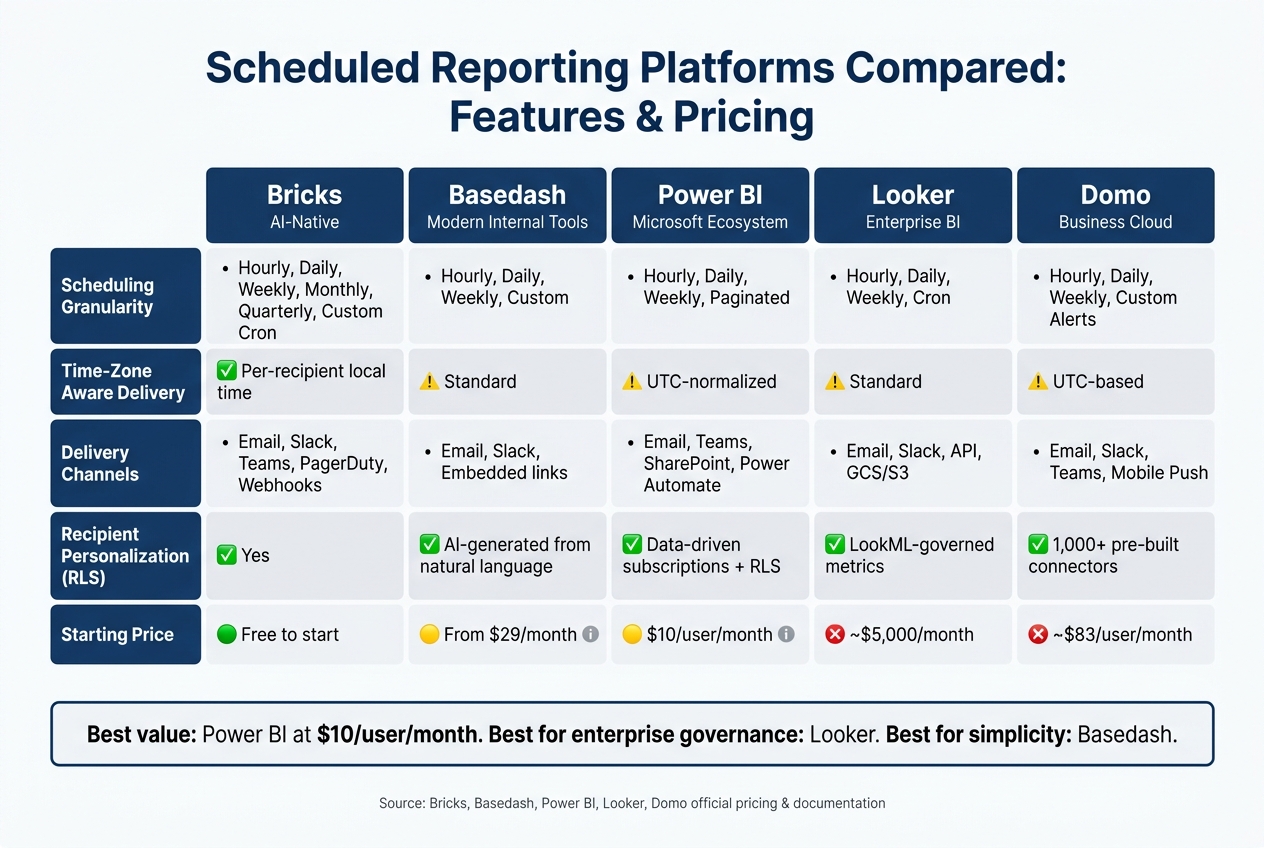
Scheduled Reporting Platforms Compared: Features & Pricing
The table below highlights the key features of five platforms, making it easier to determine which one aligns best with your business needs. Each platform offers a distinct mix of scheduling, delivery options, and pricing, helping you weigh efficiency against cost.
| Feature | Bricks | Basedash | Power BI | Looker | Domo |
|---|---|---|---|---|---|
| Scheduling Granularity | Hourly, Daily, Weekly, Monthly, Quarterly, Custom Cron | Hourly, Daily, Weekly, Custom | Hourly, Daily, Weekly, Paginated Schedules | Hourly, Daily, Weekly, Cron | Hourly, Daily, Weekly, Custom Alerts |
| Time-Zone Aware Delivery | Yes (local delivery per recipient) | Standard | UTC-normalized for some triggers | Standard | UTC-based |
| Delivery Channels | Email, Slack, Teams, PagerDuty, Webhooks | Email, Slack, Embedded links | Email, Teams, SharePoint, Power Automate | Email, Slack, API, GCS/S3 | Email, Slack, Teams, Mobile Push |
| Recipient Personalization (RLS) | Yes | AI-generated reports from natural language | Yes (data-driven subscriptions + RLS) | Yes (LookML-governed metric definitions) | Yes (1,000+ pre-built connectors) |
| Starting Price | Free to start | From $29/month | $10/user/month (Pro) | ~$5,000/month | ~$83/user/month |
Key takeaways:
- Looker stands out for enterprise-level data governance but comes with a hefty price tag of around $5,000/month, making it less accessible for smaller businesses.
- Power BI offers a strong balance of features and affordability, especially for organizations already using Microsoft tools, with pricing at $10/user/month.
- For teams looking for simplicity and AI-powered reporting, Basedash is a compelling choice, starting at $29/month.
Pricing structures differ significantly. Per-user pricing, like Tableau's $75/user/month for Creator licenses, can quickly become expensive for larger teams. Meanwhile, platforms like Databox and Bricks, which offer usage-based or unlimited-user pricing, often scale more affordably.
"The shift from manual to automated reporting isn't about dashboards - it's about giving analysts back the hours they lose to copy-paste workflows every Monday morning." - David Stodder, Senior Director of Research for Business Intelligence, TDWI
Ultimately, your choice will depend on your team size, technical expertise, and the level of customization you require.
Wrapping Up
These ten features tackle some of the biggest hurdles in SME and scale-up reporting, turning what used to be a time-consuming chore into an automated and dependable process.
By streamlining workflows, they not only improve precision but also free up time for more strategic tasks. Think about this: manual reporting can eat up countless hours, but with automation, businesses can reclaim up to 90% of that time. That’s time better spent focusing on growth and decision-making instead of piecing together data.
A smart starting point? Pinpoint one report that would make your life easier if it showed up automatically every Monday morning - whether it’s cash flow updates, sales forecasts, or ad spend summaries - and set that up first. Before diving into new tools, take a closer look at what your current systems already offer.
For more tailored solutions, check out AI for Businesses. Leveraging these features can turn your reporting process into a real asset for your business.
FAQs
How do I pick the right schedule so reports don’t go out with stale data?
To keep your data fresh, sync your reporting schedule with your data refresh cycles. For instance, schedule reports right after ETL processes finish. Use dynamic date filters to ensure your reports always reflect current data, instead of relying on fixed date ranges. For added accuracy, set up triggers like data updates or file arrivals, so reports are sent only when the data is fresh and verified.
What’s the safest way to share scheduled reports outside my company?
The best approach to sharing scheduled reports externally is to use platforms that offer per-user access controls, ensuring that recipients only view data they are authorized to see. Instead of providing direct system access, opt for secure delivery methods like encrypted email or transferring files to a secure SFTP site. To minimize the risk of accidental disclosure, clearly document any restrictions on the data. Additionally, select tools that include audit trails to track compliance and verify successful delivery.
How can one report be personalized for many recipients without duplicates?
Reports can be tailored for different recipients by using parameter-based filtering and data-access rules. With a single report template linked to each recipient's identity, the system ensures that row-level security or specific filters display only the data each recipient is allowed to see. During batch processing, the templates are automatically filled with personalized metrics or account details, allowing efficient distribution to hundreds or even thousands of recipients without needing to create separate reports manually.