Most feedback dashboards fail for one simple reason: they show data, but they don’t help me decide what to do next. If I’m choosing one, I’d focus on five things first: data connections, clear tagging, access control, useful views, and action tracking.
Here’s the short version:
- Pull from the right sources: surveys, support tickets, reviews, chat logs, usage data, and internal notes
- Connect without manual CSV work: APIs, webhooks, and native connectors matter
- Keep data under control: RBAC, SSO/SAML, audit logs, anonymization, and support for rules like GDPR and HIPAA
- Show patterns fast: filters, drill-downs, trend lines, theme summaries, and alerting
- Turn findings into action: routing, SLAs, owner assignment, prediction, and next-step recommendations
- Track whether the AI is doing its job: response accuracy near 90%–95%, sentiment accuracy near 90%, time-to-insight under 24 hours, and critical issue resolution under 48 hours
If I were narrowing down options, I wouldn’t get distracted by polished charts. I’d ask a simpler question: can my team go from raw feedback to a named owner and a clear next step without extra work? That’s what separates a nice report from a tool people will keep using.
A dashboard earns its place when it connects feedback to business results like churn risk, CSAT, NPS, retention, and support cost. So before I buy anything, I’d test it with my own data from two or three systems and check how well it handles tagging, sentiment, routing, and follow-through.
How to Create an AI Customer Feedback Analyzer Using AI Agent
sbb-itb-bec6a7e
Core Requirements: Data, Integrations, and Governance
AI insights only help if the dashboard pulls in the right data, tags it the same way every time, and keeps it locked down. That starts with reliable data: clear sources, consistent labels, and tight access control.
Data Sources and Integration Coverage
Bring in data from direct feedback, support tools, call transcripts, reviews, usage analytics, and internal notes. Some of the most useful inputs are easy to miss at first - onboarding session recordings, churn signals, and internal Slack or Teams threads. Those often surface problems before they show up in formal surveys.
To keep the dashboard current, it should support APIs, webhooks, and native connectors for systems like Salesforce, HubSpot, and common helpdesk tools. It should also show data freshness, so teams can tell whether they’re looking at live data or a batch-updated feed.
Feedback Taxonomy and Segmentation Structure
Raw feedback without labels is hard to use. A solid dashboard sorts incoming feedback with consistent labels like bug reports, UX friction, pricing concerns, feature requests, and compliance issues. Those labels should be customizable, so they match how your business talks about customer problems day to day. That’s what makes later theme detection and reporting worth anything.
Segmentation matters too. Teams should be able to filter by cohort, lifecycle stage, product area, and channel to isolate onboarding issues, renewal risks, or product-specific pain points.
Security, Compliance, and Access Controls
Use RBAC so each team sees only the data it needs. For enterprise use, governance features should include SSO/SAML integration, audit logs, field-level permissions, and data anonymization.
The dashboard should also support SOC 2 and, where needed, HIPAA, FERPA, and GDPR.
Once the data layer is set, the next test is whether the dashboard can turn all of that into action. With the data organized and governed, teams need views, filters, and drill-downs that surface patterns fast.
Key Dashboard Features to Look For
Once your data and governance are set, the next test is simple: how fast can teams read, filter, and act on feedback?
A dashboard can look polished and still slow people down. What matters is whether an executive, a manager, or a frontline rep can open it and get to the point without digging around.
Configurable Views, Drill-Downs, and Reporting
Use role-based views instead of one fixed layout.
Executives need a high-level view of quarterly themes tied to retention or revenue. Managers usually need feature-level trends. Frontline teams need live detractor alerts and common themes in open comments.
Those views matter only if people can slice the data fast. Teams should be able to filter by customer tier, region, product line, and agent. Drill-downs into AI-tagged topics or intents are especially helpful when a score shifts and teams need to see where the problem began.
Reporting should also stay out of the way. PDF or CSV exports, plus automated delivery by email or Slack, help keep reporting from turning into a manual chore. It also helps to add response-rate and action-tracker widgets so teams can see both collection health and follow-through.
Visualizations Built for Feedback Analysis
Charts should make patterns clear at a glance. You don’t need a giant gallery of visuals. You need a small set that shows movement, distribution, and root cause.
| Visualization Type | Best Use Case | Strengths | Limitations |
|---|---|---|---|
| Score Card + Sparkline | Executive at-a-glance review | Immediate clarity on current status and direction | Lacks root-cause context |
| Stacked Bar / Donut | Score distribution analysis | Reveals the volume of detractors vs. promoters and the overall risk profile | Doesn't show changes over time |
| Trend Line | Long-term monitoring | Connects score shifts to specific events like product launches or outages | Can be noisy with low sample sizes |
| Segment Heatmap | Identifying outliers | Quickly surfaces underperforming regions, tiers, or product lines | Requires high data volume for accuracy |
| Theme Summary | Root cause analysis | Groups AI-detected topics by volume and sentiment | Accuracy depends on AI/NLP model quality |
| Funnel Chart | Tracking feedback through resolution stages | Visualizes the close-the-loop process | Doesn't capture the sentiment of the resolution |
A good way to think about it: score cards tell you what happened, trend lines show when it changed, and theme summaries help explain why.
In-Product Feedback Capture and Annotation Tools
Also check whether the dashboard captures feedback at the source.
In-product widgets, thumbs up/down buttons, and star ratings make it easy to collect feedback without pulling users out of their workflow. That matters more than many teams expect. If giving feedback feels like a side quest, people often skip it.
For teams that need manual review, reviewer queues add a human layer. Trained reviewers can score, tag, and annotate responses before those responses flow into reporting.
| Feature | Data Richness | User Effort | SME Fit | Setup Complexity |
|---|---|---|---|---|
| Thumbs Up / Down | Low | Very Low | High (pulse checks) | Low |
| Star Ratings | Medium | Low | High (transactional CSAT) | Low |
| Inline Widgets | High (contextual) | Low | High (Product/UX) | Low |
| Post-Session Surveys | Medium | Medium | Medium (Support) | Low |
| Reviewer Queues | Very High | High (Internal) | High (Ops/QA) | Medium |
| Annotation Tools | High (visual) | Medium | High (Research) | Medium |
One last thing: keep widgets lightweight so they load fast and don’t slow the product.
Advanced Analytics That Turn Feedback Into Action
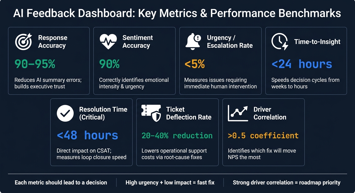
AI Feedback Dashboard: Key Metrics & Performance Benchmarks
Good visualizations show what happened. Advanced analytics show what to do next. That's the line between reporting and action.
AI-Assisted Analysis and Theme Detection
As feedback volume grows, small teams can get buried fast, especially if they don't have a dedicated analyst. AI-assisted theme detection helps by surfacing issues teams may not have thought to look for on their own.
Some platforms use dynamic taxonomies to sort feedback by persona, campaign, or product area. Modern sentiment analysis also goes past basic positive-or-negative labels. It can pick up emotional intensity and more specific signals like frustration, hesitation, excitement, or trust. On top of that, urgency scoring helps teams see what needs attention first. When those signals are paired with AI-generated outputs built for decision support instead of plain summarization, dashboards become much easier to use at scale without manual triage.
But these signals only matter if they feed prioritization and routing.
AI Quality Metrics and Business Impact Tracking
Collecting feedback only helps if the AI processing it is accurate. That’s why teams need to track AI quality next to business outcomes. It keeps the dashboard credible at the executive level.
Instead of ranking issues by raw volume alone, stronger dashboards rank reports by business impact, showing which themes matter most for annual recurring revenue (ARR), CSAT, or NPS. Driver analysis helps teams rank fixes by the outcomes they actually move, not just by how often they appear.
These models work best when they reuse the same cohort, product-area, and lifecycle tags already used across the dashboard.
| Metric | Business Impact | Practical Threshold (U.S.) |
|---|---|---|
| Response Accuracy | Reduces errors in AI summaries; builds trust in data | 90%–95% accuracy |
| Sentiment Accuracy | Correctly identifies emotional intensity and urgency | 90% accuracy |
| Urgency / Escalation Rate | Measures how many issues require immediate human intervention | <5% of total feedback |
| Time-to-Insight | Speeds up decision cycles from weeks to hours | <24 hours from collection to report |
| Resolution Time | Direct impact on CSAT; measures how fast a loop closes | <48 hours for critical issues |
| Support Ticket Deflection | Lowers operational support costs directly | 20%–40% reduction via root-cause fixes |
| Driver Correlation | Shows which fix will move NPS the most | >0.5 correlation coefficient |
The point is simple: each metric should lead to a decision. If a theme shows high urgency but low business impact, it may call for a fast fix. If it shows a strong driver correlation, it likely belongs near the top of the roadmap.
Accuracy and impact metrics should also feed straight into dashboard selection criteria.
Prediction, Experimentation, and Next-Best Actions
The most useful dashboards don't stop at past data. They point to what is likely to happen next.
Churn prediction models can scan feedback for churn signals and surface at-risk accounts before they cancel, similar to proactive support case studies where AI anticipates customer needs. AI-driven interventions based on those signals can cut churn rates by up to 30%. Some dashboards also use anomaly detection to watch feedback patterns around the clock, so sudden shifts get flagged as soon as they appear.
Next-best-action features push this a step further. They recommend specific moves, like routing a critical bug report straight to engineering with full session context, or flagging an upsell chance when a customer's feedback points to a need already covered in a higher tier. Each recommendation should show:
- the owner
- the confidence level
- the expected impact
Transparency matters here. Teams should be able to see the confidence level and the reasoning behind a prediction or recommendation, not just the output.
Tracked resolution workflows help teams test whether those recommendations were worth acting on. When a dashboard routes feedback to the right owner and tracks whether the issue was resolved or whether the metric improved, it's much easier to tell the difference between a good idea and a good outcome.
The real test is whether the dashboard makes these signals easy to verify, explain, and act on. Those outputs help teams judge whether the dashboard is accurate, explainable, and fast enough for daily decisions.
How to Evaluate and Choose the Right Dashboard
A Simple Evaluation Checklist for SMEs
Once you've finished the analytics side, the choice usually comes down to three things: fit, adoption, and operating cost. In plain English, don't pick a dashboard just because it has a long feature list. Pick the one your team will open, understand, and use when it's time to make a call.
| Criteria | What to Ask |
|---|---|
| Usability and time-to-insight | How fast does it turn feedback into an action-ready report? |
| Integration depth and scalability | Does it connect natively to core systems without CSV workarounds? |
| Governance and compliance | Does it restrict access by role and data sensitivity? |
| Close-the-loop workflow | Can it route feedback to an owner, set an SLA, and track the response? |
| Total cost of ownership | What does setup, maintenance, and internal admin time add to the subscription fee? |
One smart move: run a proof of concept with real feedback from two or three tools. Then compare sentiment and theme detection using your own data. That's where the gaps show up fast.
Using AI for Businesses as a Starting Point
If your team is still in the early stage of tool discovery, AI for Businesses can help. It offers a curated directory of AI tools for SMEs and scale-ups.
Conclusion: The Features That Matter Most
A useful AI feedback dashboard gets five things right. It pulls data from key channels without manual exports, shows themes fast, keeps sensitive data behind proper access controls, handles growing feedback volume, and routes insights to a named owner who can act on them.
Use those five filters to sort useful dashboards from polished demos. The right dashboard turns feedback into secure, measurable action.
FAQs
How do I test a dashboard with my own data?
Start by connecting your data sources to the dashboard. That might mean reviews, survey responses, sales metrics, or other customer data. Most teams do this through built-in integrations or APIs tied to tools they already use, like a CRM, survey platform, or review collection system.
Once everything is connected, you can analyze the data in real time for specific use cases, such as customer feedback. But the setup alone isn’t enough. Your team also needs to know how to read the data, spot patterns, and put those insights to work in day-to-day decisions.
Which metrics matter most for AI feedback quality?
The most important metrics are accuracy, relevance, coherence, helpfulness, and user trust. Together, they show how well AI feedback supports decision-making and overall user satisfaction.
How can a feedback dashboard reduce churn or support costs?
A feedback dashboard can cut churn and support costs by helping teams spot issues early and fix them before they snowball.
It can also flag at-risk accounts through AI-driven signals, which helps retention and can reduce support volume.